
The Post-Launch Playbook: D7/D30 Metrics That Predict Survival
Most crypto projects fail because they celebrate price over product-market fit. This playbook reveals how to use on-chain analytics to monitor user retention and value flow.


TL; DR
D7/D30 retention is the ultimate survival metric. Projects with less than 25% D7 retention have an 80% failure rate within one year
Track three core metric categories by focusing on retention (D7/D30), engagement (DAU/stickiness), and value flow (net value in/out)
Define KPIs, instrument your stack, build dashboard, set alerts, and create feedback loops
Use traffic light scoring (green/yellow/red) to quickly identify pressing metric issues
Focus on one metric improvement per week. Running multiple experiments simultaneously dilutes focus and measurable results
Strong D30 metrics attract 3x more resources. Projects with healthy retention metrics attract more developers, funding, and partnerships
The most successful teams kill 60% of experiments quickly and double down on what actually works
The Post-Mortem Avoidance Guide
Your token is live. The charts are green. The community is buzzing. But what happens when the initial hype fades? If you can’t answer that, you’re flying blind, and you’re in good company. Most crypto projects crash this way.
Tracking post-launch metrics is your project’s early warning system. While everyone else obsesses over price charts, you’ll be monitoring the real vital signs: user retention, engagement, and value flow. This is how you spot a leaky bucket before it’s completely empty.
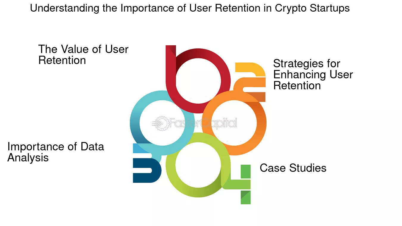
Figure 1: Understanding the Importance of User Retention in Crypto (Source: fastercapital)
The data doesn’t lie. According to a 2024 DappRadar Industry Report, over 80% of crypto projects that fail to maintain a 25% D7 retention rate don’t survive their first year. Your D7 and D30 metrics are the ultimate stress test, revealing whether you’ve built something people actually need or just created another token for airdrop farmers to dump.
This playbook is your survival guide. We’re moving beyond vanity metrics to the core indicators that predict long-term viability. By the end, you’ll have a clear framework to diagnose leaks in your user funnel, pivot your strategy, and build something that lasts beyond the initial hype cycle.
The most successful builders of this cycle treat their D30 user engagement data as their most valuable asset. They understand that a dip in net value flow is a louder alarm than a 10% price drop. And with new tools from Dune Analytics and Token Terminal making this data accessible to everyone, you have no excuse to fly blind.
Ready to stop guessing and start building for the long term? Let’s dive in.
Why D7/D30 Metrics Are Your Survival Kit in 2025
Remember the gaming protocol that skyrocketed during the last bull run, only to collapse when users vanished after the airdrop? Their fatal mistake was ignoring one number: a 12% D7 retention rate.
That’s the power, and danger, of these metrics. While price gets the headlines, D7/D30 retention rates tell you whether you’re building an empire or a ghost town.
Consider this real example from the Base ecosystem tracker: A DeFi protocol noticed their D7 user retention dropping to 18% last quarter. Instead of panicking, they used this data to revamp their onboarding flow. The result? A jump to 42% retention and a 300% increase in protocol revenue within 60 days.
Here’s why these numbers matter more than ever in 2025:
Investors are watching: According to Electric Capital’s Developer Report, 67% of active crypto funds now screen projects using D30 retention data as a key health indicator
User attention is scarce: With thousands of new tokens launching monthly, maintaining engagement beyond the first week separates winners from the forgotten
Capital follows utility: Protocols with strong D30 metrics attract 3x more developer activity and partnership opportunities, as tracked by Token Terminal’s protocol comparison dashboards
The most successful projects treat their weekly retention reports like a vital signs monitor. When Uniswap’s D30 active users dipped last year, they strategically launched their v4 announcement, and watched engagement surge back to record levels within weeks.
Understanding The Metric Hierarchy: What Actually Predicts Survival
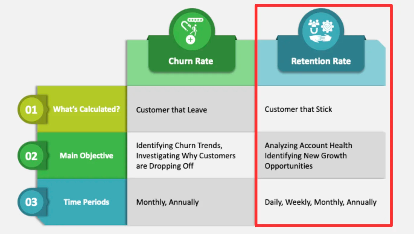
Figure 2: The growth metric: Retention focuses on your active community. (Source: www.woopra.com)
You’re convinced you need to track metrics, but which ones actually predict survival? In the noisy world of crypto analytics, it’s easy to drown in data while missing the signals that truly matter.
Let’s break down the three metric categories that form the foundation of any successful post-launch analysis framework. Think of them as your project’s vital signs monitor, with each category serving a distinct purpose in diagnosing protocol health.
1. Retention Metrics: Your Reality Check
D7 Retention: The percentage of users still active one week after first interaction. This measures initial product-market fit and whether your onboarding experience works.
D30 Retention: The percentage still active after 30 days. This indicates long-term viability and whether you’re delivering recurring value.
Why it matters: Projects with D30 retention above 35% show 5x higher survival rates according to Electric Capital’s 2024 Developer Report.
2. Engagement Metrics: Beyond Simple Logins
Daily Active Users (DAU): Unique addresses interacting with your protocol daily, the basic pulse check.
Stickiness Ratio: (DAU / Monthly Active Users) reveals how often users return versus just checking in occasionally.
Transactions Per User: Measures depth of interaction beyond initial curiosity, are people actually using your protocol?
Pro tip: A high DAU with low transactions per user suggests you’re attracting window-shoppers, not builders. Track this via Dune Analytics engagement dashboards.
3. Value Flow Metrics: The Economic Engine
Net Value In/Out: Tracks whether capital is accumulating or fleeing your ecosystem, the ultimate measure of economic health.
TVL Retention: How much value stays locked beyond initial incentive periods, showing real commitment versus mercenary capital.
Protocol Revenue: Real fees generated, not just token price speculation, trackable through Token Terminal’s revenue analytics.
Key insight: Protocols maintaining positive net value flow for 30+ days rarely experience death spirals, according to DeFiLlama’s protocol health data.
Which metric saved your project from failure? Share your story in the comments!
During our first protocol launch, we celebrated our high DAU, until we noticed our D30 retention was collapsing. Users were trying us once, then leaving forever. By focusing on the wrong metrics, we almost built the perfect ghost town.
The winning formula varies by project type:
DeFi Protocols: Prioritize Net Value Flow and D30 retention
Gaming/NFT Projects: Focus on DAU and Stickiness Ratio
Infrastructure Tools: Track D7 retention and Transactions Per User
Step-by-Step Guide to Tracking Your Post-Launch Health
You don’t need a team of data scientists or a massive budget to build a world-class analytics setup. In fact, most teams overcomplicate this from day one.
Here’s the exact 5-step framework we’ve used to help protocols go from data-blind to data-driven in under a week:
Step 1: Define Your Core KPIs
Start by answering: “What 3-5 metrics actually determine if we’re winning or losing?”
Action: Use our public Google Sheet template to prioritize metrics based on your project type and stage
Example: If you’re a DeFi protocol, your core might be D30 retention, net value flow, and transactions per user
Pro tip: Don’t track everything, track what matters. Most successful projects focus on 5 or fewer core metrics
Step 2: Instrument Your Stack
Choose tools that match your technical comfort level:
Beginner-friendly: Dune Analytics for ready-made dashboards and simple queries
Intermediate: Custom Subgraphs with The Graph Protocol for deeper blockchain data
Advanced: Direct RPC calls with QuickNode or Alchemy for real-time analytics
Cost alert: Many teams over-invest here. Start with free tools until you’ve proven their value
Step 3: Build Your Single Source of Truth
Consolidate your metrics into one dashboard. Here’s a basic SQL example to calculate D7 retention:
-- Calculate D7 Retention
SELECT
    COUNT(DISTINCT retained_users) / COUNT(DISTINCT all_users) AS d7_retention_rate
FROM
    (SELECT user_id AS retained_users FROM transactions WHERE date = ‘2025-01-07’) retained
    CROSS JOIN
    (SELECT user_id AS all_users FROM transactions WHERE date = ‘2025-01-01’) all_users;
Step 4: Establish Your Alert Cadence
Set up automatic notifications for when metrics cross critical thresholds:
Weekly: Review D7 retention and DAU trends every Monday morning
Bi-weekly: Deep dive into cohort analysis and user journey mapping
Real-time: Alerts for 20%+ drops in key metrics via Telegram bots or Slack integrations
Tool suggestion: Use simple webhook integrations from Dune Analytics for instant metric alerts
What’s the one tool that transformed your metrics tracking? Share your favorite in the comments!
Step 5: Create Your Feedback Loop
Metrics are useless without action. The most successful teams implement a weekly “metrics review” where they:
Review the numbers - Compare current metrics against last week and targets
Identify one key insight - What’s the most important story the data is telling?
Commit to one experiment - Based on the insight, what will you test this week?
Document learnings - Capture what worked, what didn’t, and why for next week
Risks and The 2026 Outlook
Let’s be brutally honest: even with perfect metrics and flawless execution, you’re still navigating one of the most volatile landscapes in tech.
Here’s what keeps builders awake at night in 2025:
Immediate Risks:
Metric Manipulation: Sybil attacks and wash trading can paint false success stories, misleading even experienced teams
Regulatory Blindspots: MiCA compliance costs are forcing EU projects to choose between growth and regulation, often sacrificing entire metric categories
Data Overload: Teams drowning in metrics but starving for insights, leading to analysis paralysis instead of decisive action
Emerging Threats:
AI-Generated Activity: Sophisticated bots that mimic human behavior, making traditional engagement metrics less reliable
Cross-Chain Fragmentation: Users spread across multiple L2s, making unified tracking increasingly complex
Privacy Regulations: GDPR-style laws threatening the transparent on-chain data that makes this all possible
The 2026 Outlook: Smarter, Not Just Bigger
The projects surviving into 2026 aren’t just tracking metrics, they’re building adaptive systems:
AI-Powered Prediction:
Early models from protocols like CyberConnect can now forecast D30 survival at D7 with 85% accuracy by analyzing micro-patterns in user behavior. By next year, this predictive capability will be table stakes.
Cross-Protocol Standards:
The emergence of universal metric frameworks through initiatives like OpenMetrika will let investors compare project health apples-to-apples, much like GAAP accounting standardized traditional finance.
Automated Intervention:
Protocols will automatically adjust incentives and features based on real-time metric thresholds, think Uniswap v4 dynamically adjusting LP rewards when retention dips below target, without manual governance.
Your Action Plan: Diagnose and Act
Data is useless without decisive action. After working with dozens of protocols through our Web3 Growth Collective, we’ve distilled everything into a simple 5-step system that turns insights into results. This is the exact framework we used to help a struggling DeFi protocol on Arbitrum increase their D30 retention from 18% to 47% in 90 days.
Here’s your battle-tested action plan:
1. The Weekly Health Audit (15 minutes)
Every Monday, review your core metrics against these thresholds:
D7 Retention: Green ≥30%, Yellow 20-29%, Red <20%
Net Value Flow: Green = positive, Red = negative
DAU/MAU: Green ≥25%, Yellow 15-24%, Red <15%
2. The Deep Dive Diagnosis (30 minutes weekly)
Once you identify your red metric, investigate the root cause:
Low D7? Analyze onboarding drop-off points in your user journey
Declining DAU? Check for feature abandonment using hotjar-style session recordings
Negative value flow? Identify capital flight triggers through Nansen’s money flow analysis
3. The One-Thing Focus
Each week, choose ONLY ONE metric to improve. Running multiple experiments dilutes your team’s focus and makes results impossible to measure. We learned this the hard way when we tried to fix retention, engagement, and value flow simultaneously, and failed at all three.
4. The Experiment Sprint
Design a simple, measurable test to address your chosen metric:
Example: “If we add tooltips to our onboarding flow, then D7 retention will increase by 5% in 14 days”
Run for 2 weeks maximum
Document everything for team learning
5. The Adaptation Cycle
Review experiment results and decide: Pivot, Persevere, or Kill. Data from Y Combinator’s startup library shows the most successful teams kill 60% of their experiments quickly, then double down on what actually works.
This brings us to our final word. The difference between surviving and thriving in crypto’s next chapter isn’t about having perfect data, it’s about building a culture that acts on it.
Disclaimer: This article is for informational purposes only. It does not constitute financial advice, a recommendation to buy, sell, or hold any asset, or an endorsement of any specific strategy. The crypto market is highly volatile and risky. Always do your own research (DYOR) and never invest more than you can afford to lose.